 Gents Mag 1780 p.131

|

|
|
|

|
introduction, lists | ||
|
|
list, 3rd qtr 18th century | ||
|
|
previous page next page
 |
||
|
Gentleman's Magazine 1780 p.131
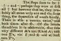
Mr. URBAN, A FEW days ago I receieved the annexed sculpture and inscription from a good friend at Lancaster, who hoped that I might be able to throw some light upon it; which, I frankly own, I am not able to do: but as others may be more fortunate, to them I recommend it through your channel; and if it may save them some trouble, I will just mention what has occurred to them on the subject. To begin with the Carving; which one would expect would speak an universal language, and consequently be readily made out; which is not, however, the case, at least with me. I see two combatants, seemingly cased in armour from head to feet; the helmets of both are remarkably pointed at top; and both plainly have stirrups, which seem to grow out of the belly of the horses, without any the least appearance of stirrup-leathers. The horses too of both seem compleatly cased in leather at least, as they exhibit no eyes, mouths, ears, or manes: but as their tails too seem equally covered, (looking more like those of large rams) perhaps the uniformity of their whole appearance should be charged to the badness of the carving: though I think not, no more than to being worn smooth by time and weather: the stirrups might be fastened to this case or shell. One bears on his left arm an oval shield, which, I believe, is an uncommon shape: his right hand is raised level with his shoulder, and he pushes a tilting spear (I venture to call it so from its swelling bigger in the middle) into the neck of his adversary, who lifts up his left hand, and lowers the banner in his right hand; both seemingly in token of yielding. It is observable that there is no appearance of his having a shield; nor has his banneret any apparent head or spike to it, and the staff is uniformly slender throughout. This, one should suppose, was the representation of some formal combat: but in these it was usual to be very exact in seeing that the combatants arms were the same in size, &c. and from the cut or indented shape of the banneret, we must conclude, that it is the Gonfannen or Ecclesiastical banner: such, I supose, was St. Cuthbert's, at Durham; which, besides appearing in processions, was sometimes advanced against the Scots, with good success: but if so, this must be the champion, Vower, advocate or avoué of the church in some dispute; and that the fight should refer to somewhat of this kind , is natural enough to think, from the place where it is fixed. But we may well wonder why a defeat of a son militant of the church should be represented. If I have made but little out of the carving, I am afraid I shall come off still worse with the inscription. In it I observe two crosses, + +. Combatants crossed themselves before they began to engage; and children before they ventured upon their A B C, hence called the Christ's-cross-row, and the sign of it is still prefixed as a mark or direction to them in their hornbooks.
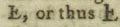
 if the first word of the 4th line ends like justitie, maestitie, tristitie, &c. are employed in this short inscription. The two first words, as I venture to call them, seem exceedingly like those that compose the last line; except a final horizontal stroke in the middle of a perpendicular stem of the 1st letter, which, perhaps, was not visible in the correspondent one of the last line, or was over-looked. If it ought not to be at all in the first letter, then one might read DominuS LVR RENDE WERE DVN ASHVM MILES DE BO ELTYN. Ð the first letter may be supposed to be the Saxon Ð; but that is, I believe, always formed with a stroke of equaly length on both sides of the perpendicular one; which is not so here; and if it was, no more insight into the meaning is gained. Mr. Burn, in his History of Cumberland. p.454, informs us, that Boeltun was one of the four ancient ways of writing Bolton. If it should be thought that the copy doth not justifying supposing that more than a single letter is wanting in M E S, we should consider that it might be wrote L E S: the I being included in L, either thus [L with a stoke] or thus
 differing only in length. But a still greater difficulty with me, is the knight's being loaded with three names, at a time when very great people had often no more than a short |
|||
|
mono-
|
|||
|
|
next page | ||
|
gazetteer links
|
|||
|
|
-- All Saints Church | ||
|
|
|||
Lakes Guides menu.